
.svg)
.svg)
.svg)
.svg)
.svg)
.svg)
.svg)
.svg)
We know signage can fall through the cracks, which isn’t ideal. This is why at Findable we act as a single point of accountability, from compliance through to installation. Our system stops things getting lost between the architect and contractor, including adherence to the requirements of NZBC F8, because not meeting this requirement can cause a headache for projects that’s felt by everyone involved, especially those in control of the budget.
If you’re not familiar with NZBC F8, that’s ok. That’s why we’re here. It’s also why this blog is here, as it provides an overview of what you need to know to help avoid any costly headaches.
What NZBC F8 Regulates
NZBC Clause F8 is the section of the New Zealand Building Code that provides for the identification of escape routes, hazards, emergency-related safety features and accessible facilities. In other words, it covers signage that communicates essential safety and access information.
The reason for the clause is related to the potential consequences of the above mentioned signage being absent. Mainly, people not being able to find their way out in an emergency and getting hurt, not being able to find an amenity (ie. toilet), and those with disabilities not being able to carry out ordinary activities within the building. One or all of those things happening would be bad, hence the Clause. And hence why it’s a clause that’s enforced.
That said, there are exclusions to be aware of. For example clause F8 does not apply to detached dwellings, individual household units within multi-unit tenant dwellings, or hotel/motel suites. The reasoning is likely based on assumed differences between spaces occupants know (i.e their own home) and those they don’t. We should note many shared spaces (i.e hallways) in multi-unit residential buildings must have signage that complies with F8 though.
There are also limitations within the clause for accessibility signage, which is only mandatory in buildings covered by section 118 of the Building Act (2004). This is because section 118 determines which buildings must provide access facilities. This makes sense - if a building has to provide access facilities then it must have signage communicating those facilities.
So what does all this mean? It means where clause F8 applies, signage must:
- Be clearly visible and readily understandable under all conditions of foreseeable use, including emergency conditions.
- Identify potential hazards and be located so that people encounter the signs before encountering the potential hazard.
- Facilitate escape to a place of safety and be located to identify the escape routes
- Meet performance criteria requirements during failure of the main lighting for a specified period of time.
- Must be located to identify accessible routes and facilities provided for people with disabilities.
- Ensure accessible routes are identified with the International Symbol of Access.
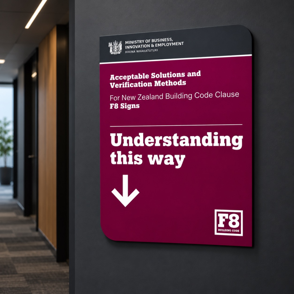
If all that sounds complicated, don’t worry. Compliance can be demonstrated by following the rather practically named ‘Acceptable Solutions and Verification Methods For NZBC F8 Signs’, published by the Ministry of Business Innovation & Employment.
Demonstrating Compliance to Clause F8
Demonstrating compliance means making sure specific design values (i.e. lettering proportions) satisfy the performance criteria established in the clause, across various factors, as detailed below:
Typography & Pictograms. This section sets the rules for language, lettering and pictogram use. Signs can be a pictogram alone, in English text with or without a pictogram, Māori text plus English text or a pictogram or both, in another language (i.e. braille) as long as there’s an accompanying pictogram or text in either English or Māori. The quick rule to remember is English is the only language which is allowed on its own without a pictogram.
Any lettering should be a vertical block type using full strokes, adhere to the proportions as defined in Clause, and have a thickness between 15-30% of the height of the letter. Upper and lower case is ok and fonts should be as ‘readable’ as those named (Arial etc). That’s a little vague to be honest, but given good wayfinding should be easily understood, there’s a design imperative for clearly understandable fonts anyway.
Finally, Braille must be uncontracted Unified English Braille and any pictograms used must conform to established standards, such as the International Symbol of Access.
Safety Signs. The guidance is very prescriptive here and plays it…safe. Safety red, yellow, green and blue are the primary colours and each has a prescribed use (i.e. safety red = stop/prohibited). In each use case, there is also a prescribed contrast colour and safety symbol colour.
The reason all safety signs look similar is because they have to conform to shape, colour and contrast rules. For example, a stop sign must be circular with a white background, include a circular band and crossbar of safety red, and have a background colour displayed over no less than 33% of the sign face. This is a good thing as there’s no room for error and to get safety signs correct, it’s a case of simply following the instructions.
Exit Signs. The thrust of the guidance here is to make sure exit signage is clearly visible, therefore the Clause gets specific as to placement. The reasons why are obvious. Rapid identification of the nearest escape route is important, particularly in buildings such as shopping malls, where most occupants tend to try and escape via the route used for entry. So where exit signs are provided to identify a door on an escape route, the sign has to be positioned on the leaf at or above handle height, or on a vertical surface within 600mm of the door.
This section also covers height and provides an equation to be followed, whereby lettering must have a minimum height (mm) equal to the maximum viewing distance (mm) divided by 210 and rounded up to the nearest 50mm. That’s right - mathematics is everywhere - even wayfinding.
Finally, this section also introduces the use of lighting and specifies illumination down to the colour and range of any lighting. There’s also a provision for photoluminescent signs in the case of power failure.
Fire Rated Safety Features. All Fire Call Points have prescribed text inclusions and colour use, and fire and smoke control doors must follow specified wording and size guidance. Again, the reasons why are obvious. There can be no room for error in emergency situations and signage has to make it abundantly clear what doors (fire/smoke) must be kept closed and where items such as hydrants are located. This level of specificity is good as it really provides step-by-step instructions to follow in order to get it right. There’s no vagueness and no room for interpretation.
Access and Facilities for people with Disabilities. The same can be said for this section. It specifies how signage must identify facilities such as accessible car parks, accessible entrances, accessible routes, and accessible services. The International Symbol of Access (a person in a wheelchair) has to be positioned consistently throughout buildings and ground marked on car parks outside. There’s also a provision for the International Symbol of Deafness, which must be used when an assistive listening system is installed and placed within 600mm of the door to the room where the system is located.
Hazards. Anything that poses a threat needs to be labelled. So that’s electrical hazards, substances and processes. But it’s also things like lifts and escalators. All those signs regularly ignored by children in the shopping mall are there for a reason, and the hope is some will actually pay attention to the signage telling them to hold the handrail and stand facing the direction of travel. That’s unlikely, but the signage needs to be there anyway.
The other inclusion is for non-potable water. If water isn’t suitable for human consumption then it has to say so by using the approved pictogram.
Sanitary Facilities. Any facilities for personal hygiene need to be identified by a sign that includes the location and who can use the facilities (male/female/unisex) and if they are accessible facilities, the International Symbol for Access also needs to be shown.
Now, we know this is a lot to remember. And it’s not even everything because while NZBC F8 fixes certain design elements, others are open to design. That is, F8 defines what a sign has to communicate and how legibly it has to do it. What it doesn’t do is fix what the sign looks like as an object. If that sounds terribly unclear and daunting, that’s ok. This really is why we’re here. We use our experience to take the requirements of F8 and build a system that complies to the code but also meets the aspirations of the brand or business. The result is signage that communicates what it has to but also what you want it to.
Want to learn more or have a question? Please contact us. We’d be happy to help.


End to end.

