
.svg)
.svg)
.svg)
.svg)
.svg)
.svg)
.svg)
.svg)
A wayfinding sign should clearly communicate direction in less than 5 seconds. Any longer and it’s failed. There’s a multitude of reasons for failure and one of the less obvious, and often overlooked reasons, is known as kerning. When it works, no-one will notice. But when it fails, the consequences can range from confusion to a potential customer journeying past your retail premises, or even a vehicle initiating a last moment change of direction that places other motorists in danger.
What is kerning?
Kerning is defined as the selective adjustment of horizontal space between a specific pair of adjacent character glyphs. In other words, the gap between two letters. It’s relatively subjective inasmuch as the space between letters has no single calculation that defines optimal kerning. Rather, it relies on the wayfinding designer to use their expertise, and to paraphrase Frank Loyd Wright, for ‘form and function to be one’. This is because the kerning must form words that are visually appealing, complementing the architectural intent, but it must make sure those words are clearly legible and instantly understandable. So form and function.
One of the most popular fonts in history is Times New Roman. Created in 1932 for the Times of London newspaper, it was the default font on Microsoft applications for 15 years, spanning from 1992 until 2007 (when it was replaced by Calibri). Visually it looks perfectly balanced but look closer and you’ll notice the kerning, with different gap spaces between letters. Those with straight edges (I and H) have more physical space between them and the adjacent letter, whereas rounded letters (O and C) have less.
It gets more complicated. The space between letters isn’t consistent across the entire alphabet, so New Times Roman has a set of rules for ‘Kerning Pairs’. These rules adjust the gap between specific letter combinations in order to maintain both form and function regardless of the word being formed. If that sounds overly complicated, it’s because it has to be. And because it really matters in Wayfinding.
Why Kerning matters in Wayfinding
One of the primary objectives of wayfinding is clear communication. As mentioned earlier, the sign reader should be able to get the information they need in less than 5 seconds, and kerning directly impacts the speed of sign comprehension.
This speed of comprehension needs to also account for distance, meaning kerning has to too. The industry standard for sign readability is 1 inch of letter height for every 10 feet of viewing distance, meaning any kerning issues can become magnified. Larger letters don’t necessarily make for clearer words and descriptive or script fonts are often as problematic in larger font sizes as they are in smaller sizes.
While readability is obviously important in wayfinding, it’s not the only issue, because if it was then all signs would use Highway Gothic as the font. This is the primary font for road signage in New Zealand because of its legibility at high moving speeds. It wouldn’t be suitable for a Shakespeare themed hotel though (should one exist). Visitors would expect to see a more decorative font that closely resembles the writing style of the time. Using such fonts in signage is tricky and this is where kerning really matters. It has to carefully balance the visual style with effectiveness.
Granted, that’s a slightly absurd example but it’s shared to make a point. Kerning must interpret the aesthetic through a lens of legibility in order to create a wayfinding system that both consciously informs direction and subconsciously informs the visitor's experience.
For commercial brands this becomes especially important. A brand is communicated through the overall brand experience and wayfinding impacts this experience but introducing either clarity or confusion. Kerning has an impact here and should it be wrong, then experience and consumer satisfaction suffer, which has a direct cause and effect relationship to profitability. That may sound far-fetched but it’s not.
Indeed, the impact isn’t just related to commercial brands. A study at the Emory University Hospital in Atlanta concluded that US$400,000 is wasted every year due to wayfinding issues resulting in missed appointments and lost staff time. Now that’s a subject for another blog, but we share it here to prove the relationship between kerning and profitability, showing how kerning is needed for effective wayfinding and wayfinding impacts financial results.
Good and Bad Kerning in Wayfinding
Before we share a couple of examples of good and bad kerning, we should share that bad kerning is sometimes referred to as keming. Note how the ‘m’ looks like a ‘r’ and ‘n’. This is funny to wayfinding geeks like us. Possibly not for anyone else though!
Moving swiftly on, when kerning goes wrong it can literally change the words we read, as these examples show.
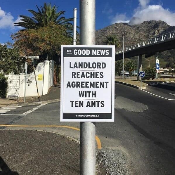

These might be amusing but they’re shared to make a serious point. Inattention can easily render any sign ineffective and when those signs are part of a wayfinding solution, people will get lost, and the business will lose money.
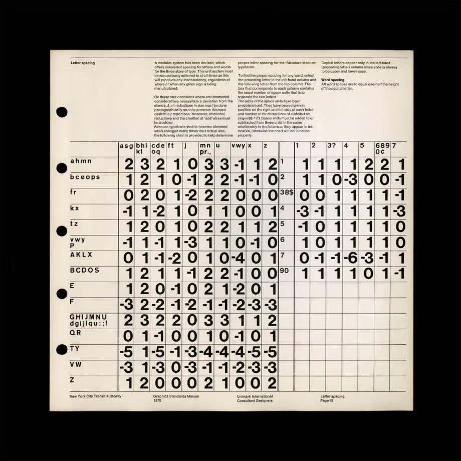
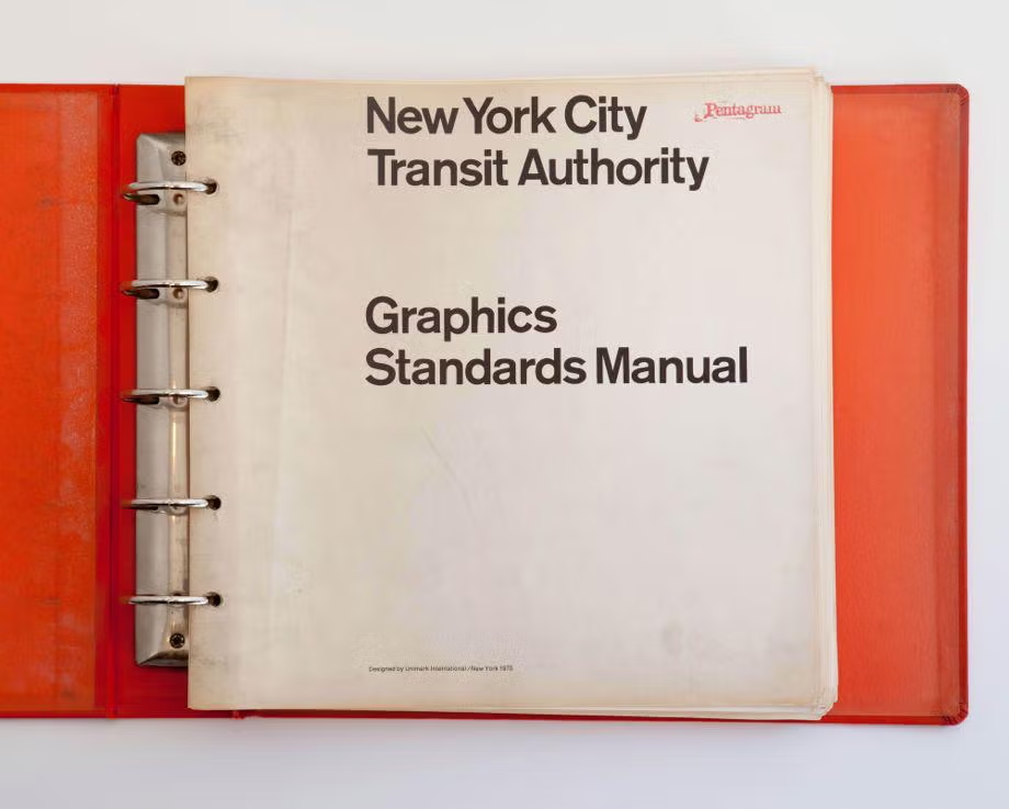
However, the reality is these examples are few and far between (that’s a kerning joke by the way). Where kerning has been perfected, it solves very real issues. For example, navigating the New York subway in the 1960s was considered to be less than pleasurable. Indeed, it was a convoluted mess of inconsistent signage that would have commuters breaking out in a cold sweat. Enter Massimo Vignelli and Bob Noorda, who spent years studying commuter behaviour before creating a solution that’s considered one of the pre-eminent examples of wayfinding today. Their 1970 Graphics Standards Manual was incredibly detailed and Vignelli famously specified every possible letter combination and the spacing that must be allowed between each letter.
In case you’re interested (and if you've read this far we suspect you might be) for 52 capital and lower case letters, you need 2704 different spaces.
Within these, there are a few well-known letter combinations to be wary of. For example, capital letters with diagonal strokes (AV, VA, AW, WA) create triangular gaps that need filling, while the letter T has a crossbar that hovers above lower case letters and can cause issues. And then there’s CL. Spaced improperly in the word ‘CLICK’, it can be misconstrued for something else entirely. We’ll leave you to Google that one.
Kerning really does matter to wayfinding. The thing is, good kerning goes unnoticed. That’s by design and good wayfinding itself is absorbed rather than consciously appreciated. Yet problems arise when bad kerning goes unnoticed, too. It might not create different words as in the examples shared, and it still might allow for reasonably quick comprehension, but the sense that there’s something off with the words undermines the business whose signage is being read. We’re never fully aware of how everything impacts our opinions and it’s in these fine, unseen margins, where wayfinding not only lets a traveller find their way to a destination, but also find their way to a positive experience.





End to end.

